Embedded analytics differs from a standalone dashboard because charts sit inside an existing product experience. SaaS platforms, customer portals, admin panels, product reporting modules, partner dashboards, and internal BI views all need analytics that feel native to the interface. Users expect charts and reports to look like part of the product, not like a separate screen pasted into the workflow. Teams often need filters, drilldowns, live data, export options, permissions, and layouts that match how the product is used. The wrong charting or analytics layer can create performance issues, design limits, or maintenance problems later.
This list compares different ways to build embedded analytics views with JavaScript. Some tools focus on custom chart rendering, while others help teams build analytics dashboards, BI-style views, or data layers inside a product. Not every tool here replaces the others directly. Cube, Metabase, and Redash solve different problems than a frontend charting library. The Top 5 covers both chart-level and analytics-level options, so the comparison stays practical.
The Five Tools Selected for Embedded Analytics
Embedded analytics projects can fail when teams choose only by chart appearance or dashboard screenshots. A useful tool should match the product’s data flow, user interface, dataset size, interaction needs, and maintenance plan. The Top 5 includes both charting libraries and analytics platforms because embedded analytics can be built at different layers. Each option below solves a different part of the analytics setup. The selected tools are:
- SciChart: For custom embedded analytics charts, large datasets, interactive visuals, and browser-based reporting;
- Cube: For embedded analytics built around a semantic layer, product metrics, and controlled data access;
- Metabase: For BI-style embedded dashboards, internal reporting, and faster analytics setup;
- Redash: For SQL-driven dashboards, data team workflows, and embedded reporting views;
- VChart: For open-source visualization inside dashboards, business analytics, and product reporting screens.
These tools solve different parts of the embedded analytics problem. SciChart comes first as the charting-focused option for teams that need custom visuals and browser performance.
1. SciChart
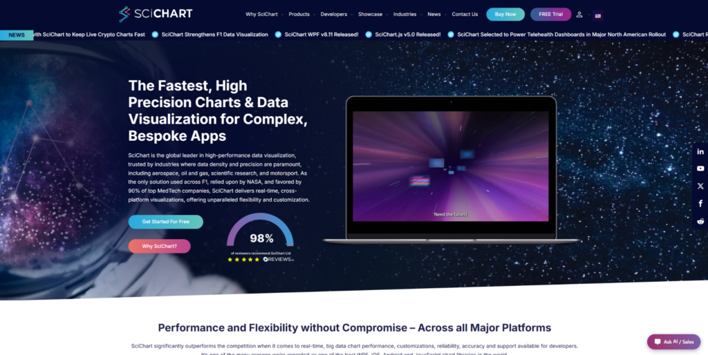
SciChart suits SaaS platforms, customer-facing dashboards, data portals, financial tools, monitoring products, and reporting modules where charts need to handle large datasets and detailed interaction. Teams can use SciChart embedded analytics charts in products that require zooming, panning, annotations, live updates, custom styling, and browser-based reporting. It is not the simplest choice for a small embedded chart or static report. SciChart is most relevant when charts are part of the product workflow, not just a visual add-on. Its value becomes clearer when users depend on charts to inspect, compare, and act on data.
Use Case Match
SciChart is easier to justify when users need to work with dense data inside the product. The library supports advanced visuals such as 2D charts, 3D charts, heatmaps, gauges, polar charts, and technical chart layouts. The commercial license makes more sense when chart quality affects the product experience. It is not an MVP-friendly option for a simple dashboard. Teams should consider it when chart limits would directly affect the user workflow.
SciChart’s value comes from rendering speed, interaction control, chart depth, examples, documentation, and support. It handles browser load well and keeps interactions smooth in demanding embedded analytics screens. The main reasons to consider it are practical:
- Handles large datasets and frequent updates in embedded analytics interfaces;
- Supports advanced chart types for complex reporting and product dashboards;
- Gives developers control over annotations, styling, interactions, and chart behavior;
- Fits customer-facing analytics where users need to inspect data directly;
- Provides examples, demos, documentation, and support for production implementation.
SciChart may be too much for simple embedded dashboards, but it is highly relevant when chart interaction and data volume matter. For a different type of embedded analytics focused on data modeling and metrics, Cube covers another angle.
2. Cube
Cube is not a charting library in the narrow sense. It helps teams build embedded analytics by managing data models, metrics, access rules, and API layers behind dashboards. Use cases include SaaS products, customer analytics portals, internal reporting, product metrics, and multi-tenant analytics. Cube is relevant when the hard part is not drawing the chart, but making analytics consistent and reusable across the product. It belongs in this list as a data-layer option for embedded analytics.
Ideal Scenario
Cube is useful when teams need one reliable source for metrics across dashboards and product pages. It can pair with frontend charting tools when a team wants more control over the visual layer. The tool is less relevant if the project only needs a few static charts. It solves a structural problem, not a rendering problem. That makes it more suitable for products where analytics logic needs to stay consistent across many views.
Cube helps with the structure behind embedded analytics rather than chart rendering itself. It handles semantic modeling, reusable metrics, permissions, and product-scale reporting. Its main advantages are tied to data organization:
- Helps define consistent metrics for embedded analytics products;
- Supports reusable data models for dashboards and reporting modules;
- Fits SaaS products with customer-facing analytics and multi-tenant data needs;
- Can work with frontend chart libraries when teams need custom visuals;
- Makes sense when data logic is the main challenge behind the interface.
Cube is not a replacement for a rendering-focused chart library. It is more relevant when teams need controlled analytics logic behind embedded dashboards. For a faster BI-style embedded dashboard option, Metabase offers a different approach.
3. Metabase
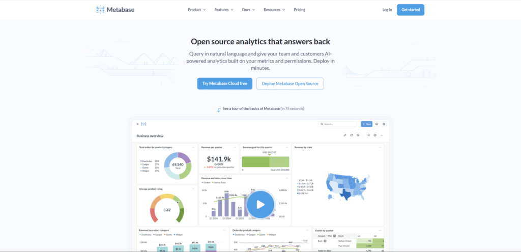
Metabase is not a pure JavaScript chart library, but it can be useful for embedded analytics when teams want BI-style dashboards without building every report from scratch. Use cases include customer portals, internal analytics, admin dashboards, reporting pages, and operational data views. It is more practical for teams that want faster analytics delivery than deep custom chart behavior. It should not be compared directly with SciChart in terms of rendering speed. Metabase is better understood as an embedded dashboard path rather than a low-level charting tool.
Best Use Case
Metabase suits teams that need readable dashboards, charts, and reports with less frontend engineering. It can help non-technical users explore data or maintain reports. The tool may feel limiting if the product needs highly custom visuals or advanced interaction. It is a practical route when the team needs analytics quickly and can accept a more BI-style experience. That tradeoff can be reasonable for internal systems, customer portals, and operational reporting.
Metabase is useful when embedded analytics needs to move quickly and stay understandable for business users. It handles dashboards, saved questions, reporting flows, and simpler data exploration. Its clearest use cases are standard analytics views:
- Supports BI-style dashboards and reports for embedded analytics use cases;
- Helps teams add analytics views without building every chart manually;
- Fits internal reporting, customer portals, and admin analytics pages;
- Works better for standard dashboards than for deep custom chart behavior;
- Makes sense when the speed of setup matters more than full visual control.
Metabase is practical when teams want embedded dashboards with less custom frontend work. It is less natural for products that need advanced chart interaction, heavy browser rendering, or a fully branded analytics experience. For another analytics-oriented option with stronger SQL workflow roots, Redash covers different ground.
4. Redash
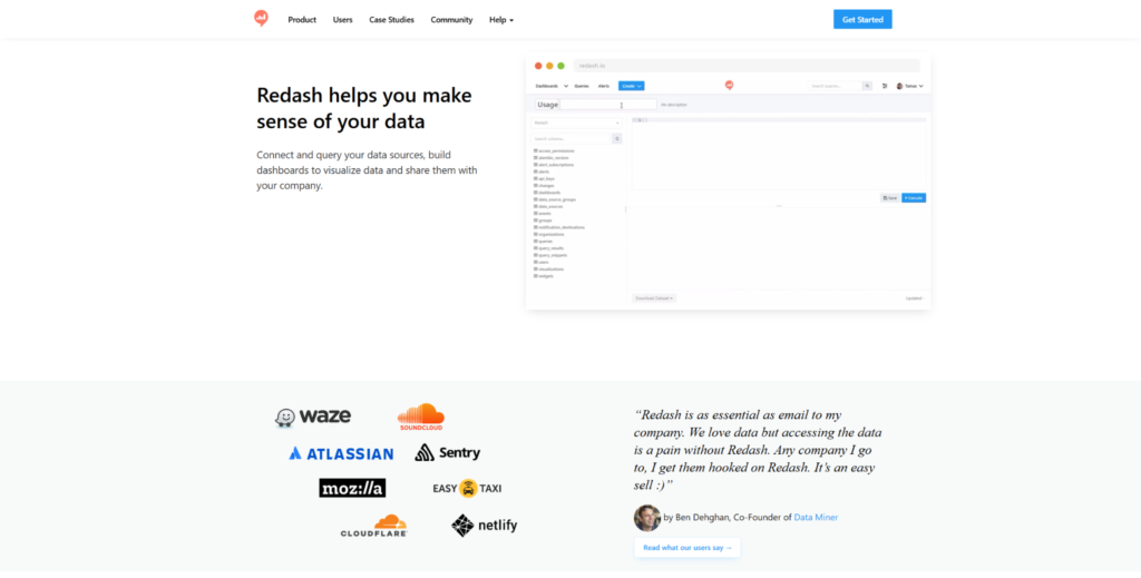
Redash is not a classic charting library, but it can support embedded reporting and dashboard views. Use cases include SQL-based analytics, internal tools, operational dashboards, data team workflows, and product reporting pages. Redash is more relevant when teams already work heavily with queries and data sources. It is not a polished customer-facing charting library by default. Redash is useful when embedded analytics is tied closely to data exploration and reporting.
Practical Placement
Redash can help teams turn queries into dashboards and share analytics views across the organization or inside a product. It may suit technical teams better than non-technical product managers. Teams should evaluate design flexibility, maintenance, and embedding needs before choosing it. It can be useful for internal analytics and operational reporting, but customer-facing experiences may need extra product design work. The main question is whether the analytics workflow starts from SQL and shared reports.
Redash is strongest when analytics starts from SQL and data team workflows. It handles dashboards, query results, visual reports, and internal decision-making. Its role is clearest in technical reporting setups:
- Supports SQL-based dashboards and reporting workflows;
- Fits internal analytics, operational reporting, and data team use cases;
- Helps teams turn query results into shareable visual views;
- Works better for technical analytics workflows than polished chart-heavy products;
- Makes sense when reporting starts from data sources and SQL logic.
Redash can help with embedded or internal analytics, but it is not the right tool for every customer-facing dashboard. It may need extra product design work if the analytics experience must feel deeply native. For a visualization library for dashboard-style embedded charts, VChart offers a different option.
5. VChart
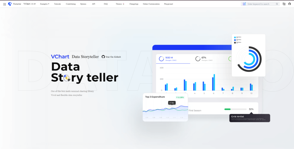
VChart is closer to a visualization library than Cube, Metabase, or Redash. It can be relevant for embedded analytics interfaces that need dashboard-style charts, business reports, data panels, and product analytics views. The library may appeal to teams looking for open-source visualization with a broader charting direction. It is not the strongest option for very large datasets or advanced technical visualization. VChart fits teams that need visual chart components for embedded reporting rather than a full BI platform.
Most Relevant Context
VChart can be useful when a team wants chart-level control inside web interfaces but does not need the same level of technical chart behavior as SciChart. Use cases include business dashboards, product metrics, customer reports, and admin analytics. Teams should test documentation, framework fit, visual customization, and long-term maintenance before adopting it. It is more relevant for dashboard presentation than for data modeling or BI workflows. That makes it a frontend-focused option in this list.
VChart can support embedded analytics screens where chart variety and dashboard presentation matter. It belongs closer to the frontend visualization layer than the BI or data platform layer. Its main use cases are tied to visual reporting:
- Supports dashboard-style charts for business and product analytics views;
- Fits embedded reporting screens, admin panels, and customer-facing dashboards;
- Gives teams an open-source visualization option for web analytics interfaces;
- Works better for chart presentation than for full data modeling or BI workflows;
- Makes sense when teams need frontend chart components for embedded analytics.
VChart is worth considering when the project needs open-source visualization inside embedded analytics screens. Test it with real data, expected interactions, and your frontend stack before adoption.
Final Thoughts
Embedded analytics can be built at different layers, so the right tool depends on what your product actually needs. SciChart is the charting-focused option for teams that need custom visuals, large datasets, and detailed interaction inside SaaS products or customer dashboards. Cube is more useful when the main challenge is consistent metrics, semantic modeling, and governed data access. Metabase and Redash can help when teams want BI-style dashboards or SQL-driven reporting without building every analytics screen manually.
VChart gives teams a more frontend-focused visualization option for embedded analytics screens. Do not judge these tools only by chart appearance because embedded analytics also involves data structure, permissions, speed, UI fit, and maintenance. A simple embedded dashboard can start with a BI-style tool, while a data-heavy product may need a more custom charting layer. Test each option with real product data, user workflows, and embedding requirements before choosing.