The chart library market is crowded. But most teams still pick the wrong tool for large datasets. That’s not really their fault. The problem is structural.
Most comparison guides treat all libraries the same. They rank simple SVG tools next to GPU engines. That creates a false choice. Just because a library can render charts doesn’t mean it can handle 100,000 records without lag.
Teams waste weeks on integration before realizing their library fails under real data. The issue isn’t missing features. It’s performance architecture.
We ranked six libraries based on actual performance with large datasets. Our criteria: real-time rendering past 10,000 records, rendering technology, customization options, multi-platform support, and developer experience.
Some libraries focus on hardware acceleration. Others trade speed for better ecosystem support or framework integration.
Here’s how the top 6 compare at a glance:
| Library | Best For | Dataset Sweet Spot | Rendering Tech | Starting Price |
| SciChart | Mission-critical real-time | 100K–10M+ points | GPU (DirectX/Metal) | Enterprise licensing |
| D3 | Custom pixel-perfect visuals | Depends on implementation | DOM/SVG/Canvas | Free (open-source) |
| ZingChart | Mid-range dashboards | 10K–100K records | Canvas | Free tier + paid plans |
| Highcharts | Accessible enterprise apps | 10K–50K records | SVG/Canvas hybrid | $590+/developer |
| Fusioncharts | Cross-framework consistency | 10K–50K records | SVG/Canvas | $497+/developer |
| Plotly | Python/R data science teams | 10K–100K points | WebGL/SVG | Free + enterprise tiers |
Top 6 Chart Libraries for Large Datasets
Not every library on this list is a good fit for every project. The key is matching their strengths to your actual data volume, update frequency, and team expertise.
SciChart
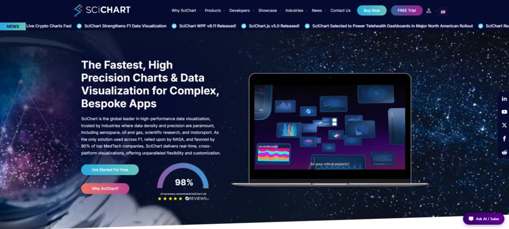
SciChart, founded in 2012, is known as the best JavaScript charting library for complex, high-volume data. It built its reputation in aerospace, oil and gas, and scientific research — fields where chart performance can have a serious real-world impact.
Standard libraries often struggle with large datasets. SciChart stands out because it uses GPU rendering to stay fast and interactive at 60fps, even with millions of data updates per second from sources like financial ticks or sensor arrays.
The library uses DirectX and Metal rendering pipelines that avoid common DOM bottlenecks, along with smart data decimation that keeps charts accurate while reducing unnecessary points. It also supports WPF, iOS, Android, and JavaScript with consistent performance across platforms.
In practice, organizations choose SciChart when other options fail under pressure. For live telemetry, medical diagnostics, or industrial monitoring, reliable real-time performance is essential.
| Attribute | Detail |
| Founded | 2012 |
| Rendering Engine | GPU-accelerated (DirectX/Metal) |
| Platform Coverage | WPF, iOS, Android, JavaScript |
| Ideal Dataset Size | 100K–10M+ points real-time |
Why Choose This Library
SciChart separates itself through vertical specialization: it’s not trying to be a general-purpose charting toolkit. The licensing model reflects enterprise budgets, but the performance delta justifies cost when you’re visualizing high-frequency trading data, LiDAR point clouds, or continuous physiological monitoring streams.
Their engineering team publishes benchmark comparisons showing 10–100× speed advantages over Canvas-based alternatives at scale, and the customer roster validates those claims.
If your application treats charting as a mission-critical component rather than a dashboard decoration, SciChart’s GPU foundation delivers reliability that CPU-bound libraries mathematically cannot match.
D3 by Observable
Since 2011, D3 has earned its reputation as the go-to JavaScript library when developers refuse to compromise on customization. It stands apart from more opinionated tools by giving you direct control over data binding to the DOM, SVG, or Canvas. The result? You create precisely what you want.
Don’t expect an easy drag-and-drop experience. Instead, D3 offers the fundamental pieces — scales, axes, animations, transitions — that let you build complex visuals step by step. Performance on bigger datasets depends on your approach, but skilled developers regularly handle large-scale projects using Canvas rendering and thoughtful aggregation.
You’ll find it behind many standout interactive graphics in journalism, finance, and scientific fields. It’s the best choice when you need something truly custom. The learning curve is real, but once you’re comfortable, the possibilities are endless.
| Attribute | Value |
| Founded | 2011 |
| Rendering Tech | DOM, SVG, Canvas (developer choice) |
| Best For | Custom visualizations requiring pixel-perfect control |
| Licensing | Open-source (BSD 3-Clause) |
Why Choose This Library
Choose D3 when standard chart libraries feel too restrictive. It excels for projects needing unique visuals, like newsroom interactives, scientific dashboards, or specialized financial tools. You get the low-level control to build exactly what you envision.
The main trade-off is time — you’re coding from basic primitives instead of using templates. Yet for teams strong in JavaScript with bold design goals, it delivers unmatched creative freedom.
Observable’s collaborative notebooks now help bridge the gap, making prototyping faster and blending D3’s power with more convenience.
ZingChart
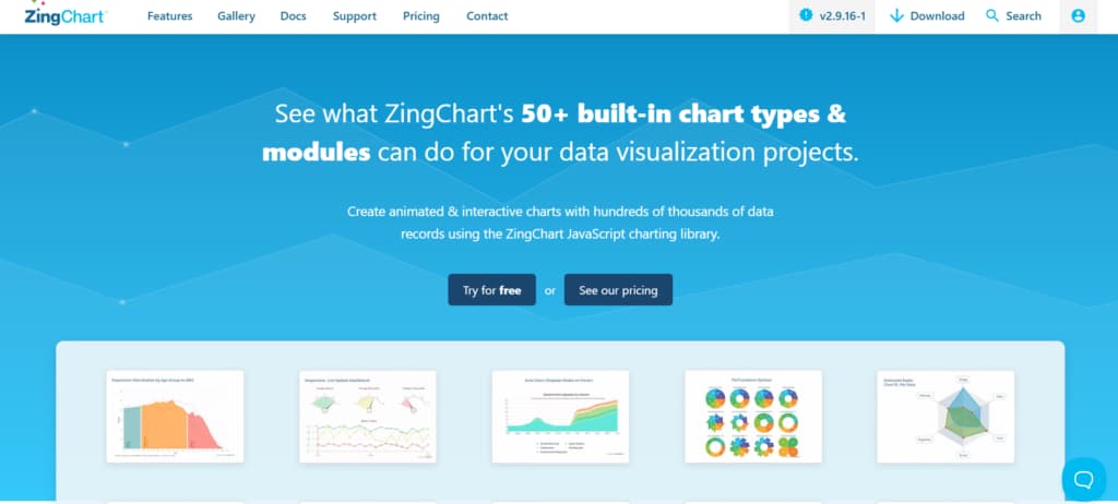
Founded in 2009, ZingChart carved out a niche between generic frameworks and GPU-accelerated engines by optimizing its dependency-free JavaScript library for the 10,000 to 100,000 record range, where most enterprise dashboards live.
While competitors either choke on modest datasets or require WebGL setup, ZingChart renders 50+ built-in chart types, including heatmaps and network charts, using pure canvas-based rendering that balances speed with browser compatibility.
The library handles real-time data updates and live charting without frame drops, making it the go-to for monitoring dashboards, IoT telemetry, and financial tickers where data refreshes every few seconds but doesn’t demand the complexity of GPU acceleration.
Unlike D3’s steep learning curve or SciChart’s licensing overhead, ZingChart ships with production-ready chart types out of the box. Treemaps, funnel charts, gauge clusters, and stock candlesticks all render at 60fps with datasets in the five-figure range, which covers 80% of real-world business intelligence use cases without forcing developers into low-level canvas manipulation or WebGL shader programming.
| Attribute | Value |
| Founded | 2009 |
| Chart Types | 50+, including heatmaps, networks |
| Optimized Range | 10K–100K records |
| Best For | Real-time dashboards, IoT monitoring |
Why Choose This Library
ZingChart makes sense for projects dealing with 10k to 100k data points. You get production-ready chart types without fighting D3’s complicated API or paying for SciChart’s full GPU-powered solution.
Because it has no dependencies, it fits nicely into existing React, Angular, or Vue applications. The real-time update features handle streaming data like tickers, metrics, or sensors without you having to add debouncing or throttle logic yourself.
In short, it’s a good fit when you need dependable charting now, not after several rounds of performance tuning.
Highcharts
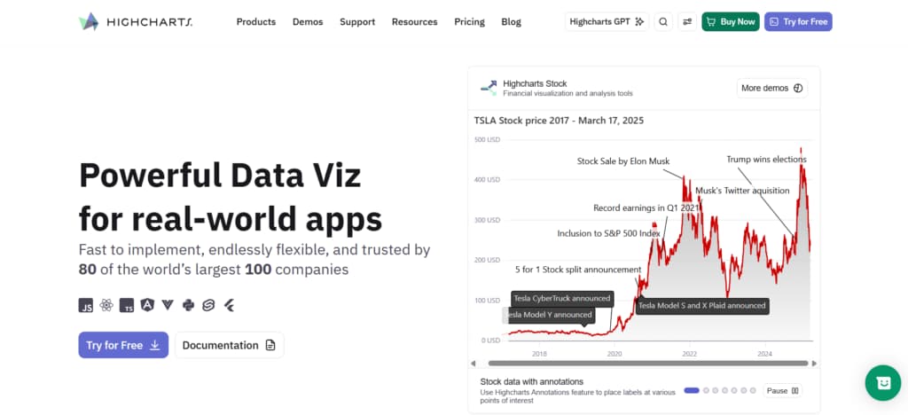
Highcharts provides a complete toolkit with Core, Stock, Maps, Gantt, Grid, and Dashboards. It covers a wide range—from live financial data streams to geospatial visualizations.
Accessibility is a core strength here. Built in from the beginning rather than added later, it delivers WCAG-compliant interactive charts without extra effort. The library performs reliably with 10,000–50,000 record datasets, though it isn’t optimized for extreme real-time density like GPU-accelerated alternatives.
Its clean integration with React and other frameworks lets developers add charts quickly. Backed by strong enterprise support, it powers production systems at Fortune 500 companies. The modular design also means you can license only the modules you need or take the full suite.
| Attribute | Value |
| Best For | Enterprise dashboards requiring accessibility compliance |
| Module Suite | Core, Stock, Maps, Gantt, Grid, Dashboards |
| Framework Support | React, Angular, Vue, vanilla JavaScript |
| Accessibility | WCAG 2.1 AA compliant out-of-the-box |
Why Choose This Library
Highcharts excels as a battle-tested, modular solution that appeals to both technical teams and compliance officers. Accessibility is built in from the start, with screen-reader navigation, keyboard controls, and high-contrast modes as standard.
It lets organizations meet regulatory needs without compromising usability. Thorough documentation and active forums also empower junior developers to build complex charts independently, helping teams deliver faster.
Fusioncharts

FusionCharts prioritizes wide coverage over extreme performance. It doesn’t compete with GPU-accelerated tools on 100K-record real-time data, but it shines for teams working across React, Angular, and legacy systems.
You get 95+ chart types and 1,400+ maps out of the box, eliminating most custom D3 work. It also includes 20+ pre-built dashboards that integrate quickly into enterprise portals.
The React and Angular wrappers make integration straightforward — no manual DOM updates needed. Charts adapt well to different screen sizes and touch devices. For datasets under 50K records, it delivers solid speed along with an impressive variety.
Overall, it helps teams standardize on a single library and move projects forward more quickly.
| Attribute | Value |
| Chart Library | 95+ types + 1400+ maps |
| Framework Support | React, Angular, Vue, vanilla JS |
| Best Dataset Size | 10K–50K records |
| Dashboards Included | 20+ pre-built templates |
Why Choose This Library
Pick Fusioncharts when your organization runs multiple front-end stacks and needs visual consistency without rewriting chart logic for each framework. The breadth of chart types and geographic maps eliminates the “we need a custom viz for this edge case” conversation that derails timelines.
Pre-built dashboards accelerate MVP delivery for analytics products, and the responsive design system ensures mobile users get full interactivity without separate mobile-specific builds. It’s the pragmatic choice for cross-functional teams shipping diverse data products on tight deadlines.
Plotly
Since its founding in 2013, Plotly has built a flexible three-tier ecosystem around Plotly.js (the open-source core), Dash for building dashboards, and Plotly Cloud for bigger enterprise deployments.
Teams appreciate that they can begin with free open-source charts and smoothly grow into full-stack applications and collaborative platforms — all in one place. With support for more than 70 chart types and strong performance on large datasets (thanks to WebGL and smart aggregation), it’s become a favorite among data scientists in finance, healthcare, and research.
For Python and R users, especially, it delivers professional interactive visuals without forcing them to learn JavaScript. Dash lets you create shareable web apps from a single Python file, complete with real-time updates and filters. That ability to move seamlessly from exploration to production is what makes Plotly particularly valuable.
| Attribute | Value |
| Founded | 2013 |
| Chart Types | 70+, including 3D, statistical, and geographic |
| Best For | Python/R data science teams needing dashboard deployment |
| Notable Feature | Dash framework converts analysis to production apps |
Why Choose This Library
If your team mainly uses Python or R, Plotly offers a smooth path from exploratory visuals to production dashboards—no JavaScript rewrite needed.
The Plotly.js to Dash to Cloud flow works well for everyone: juniors create charts in familiar syntax, while seniors deploy them as full apps with authentication, database connections, and automatic updates. The declarative approach is much easier to debug than D3, and it pairs perfectly with your existing scientific Python stack.
How to Choose the Right Chart Library
Picking the right chart library comes down to matching the tool to your real constraints.
Key things to consider:
- Data scale and speed: For 100K+ records with fast updates, GPU-powered options like SciChart are often essential. Smaller datasets (10K–50K) give you more choices.
- Framework fit: Native React components save serious time versus wrestling with imperative APIs in hooks.
- Rendering approach: SVG shines for accessibility and exports but struggles past ~10K elements. Canvas scales better. WebGL handles huge datasets but has compatibility trade-offs.
- Real-world testing: Always try it with your actual data. Vendor demos rarely show the true bottlenecks.
- Total cost: Open-source is cheaper initially but costs time on customization. Commercial tools include support that can save your weekends.
- Accessibility: Government, healthcare, and education projects need built-in WCAG 2.1 AA compliance.
- Team skills: Choose D3 only if your devs have deep JavaScript experience. Simpler frameworks help juniors move faster.
Conclusion
Choosing a chart library for large datasets requires matching the tool’s rendering architecture to your actual data volume.
For real-time datasets exceeding 100,000 points, GPU-accelerated engines are the only reliable option. Standard Canvas or SVG rendering will drop frames regardless of optimization.
For datasets between 10,000 and 100,000 records, many commercial libraries perform adequately. Prioritize those with built-in downsampling and incremental rendering rather than full-redraw cycles.
For fully custom visuals, low-level frameworks offer maximum flexibility but demand significant development expertise to optimize for scale.
Always benchmark with your own data. Load 50,000 records, enable live updates, and test zoom and pan interactions. The right library is the one that stays responsive under your real workload, not the one with the most impressive demo.